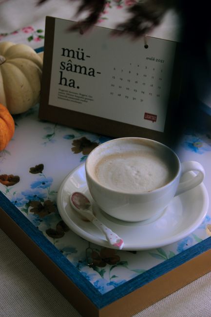
Color Doesn't Decorate a Mood — It Helps Regulate One
Warm and cool palettes don't just look different; they shift arousal, attention, and felt safety in predictable ways — which is why choosing a card's colors is closer to emotional first aid than interior design.


Color Doesn't Decorate a Mood — It Helps Regulate One
This piece steps back: color in general is one of the fastest levers we have for shifting how someone feels when they open a message, often before they've read a word.
That's not metaphor. Color contact emotional processing early — visual imagery engages emotion-related brain networks more broadly than language alone — and decades of color-psychology research (including Elliot and Maier's review of color and psychological functioning) treat hue, saturation, and lightness as variables that predictably nudge arousal, valence, and approach/avoidance tendencies.
Warm vs. cool — not taste, regulation
Warm palettes (red-orange-yellow families, high saturation) tend to increase felt energy and attentional grab. They can read as celebratory, urgent, intimate, or overwhelming depending on context — but they rarely whisper.
Cool palettes (blue-green-violet, especially desaturated) tend to lower physiological arousal and read as calmer, more spacious, sometimes melancholy. They're why "sympathy blue" became a cliché: the association is overused because the underlying effect is real.
Neither is universally "better." Someone grieving an anniversary may need cool quiet; someone you want to energize on a hard Monday may need warm lift. The mistake is treating color as neutral packaging for words that do the real work.
Nugget: You're not picking a palette that matches an occasion label. You're picking one that matches the emotional state you want the recipient to move toward — calm down, perk up, feel held, feel seen.
Saturation and lightness matter as much as hue
A muted sage and a neon lime are both "green" emotionally only in the botanical sense. Saturation controls intensity; lightness controls weight. Dark, saturated reds feel different from pale blush pinks even when both register as "warm."
For senders browsing card imagery, this is the practical filter:
| If you want the recipient to feel… | Lean toward… |
|---|---|
| Grounded, unhurried | Desaturated cool or neutral earth tones |
| Celebrated, awake | Saturated warm accents on lighter fields |
| Tender without heaviness | Light warm neutrals, soft pinks/ambers |
| Solemn but not cold | Deep cool tones with one warm highlight |
Color as co-regulation at a distance
Mood regulation isn't always solo — therapists, partners, and friends co-regulate each other through tone, pace, and environment. A digital card is a tiny environmental shift: for thirty seconds the recipient's screen holds a palette chosen for them.
That only works when the palette is intentional. Generic template rainbows or maximal-saturation "celebration" defaults often overshoot — the emotional equivalent of shouting when someone needed a hand on the shoulder.
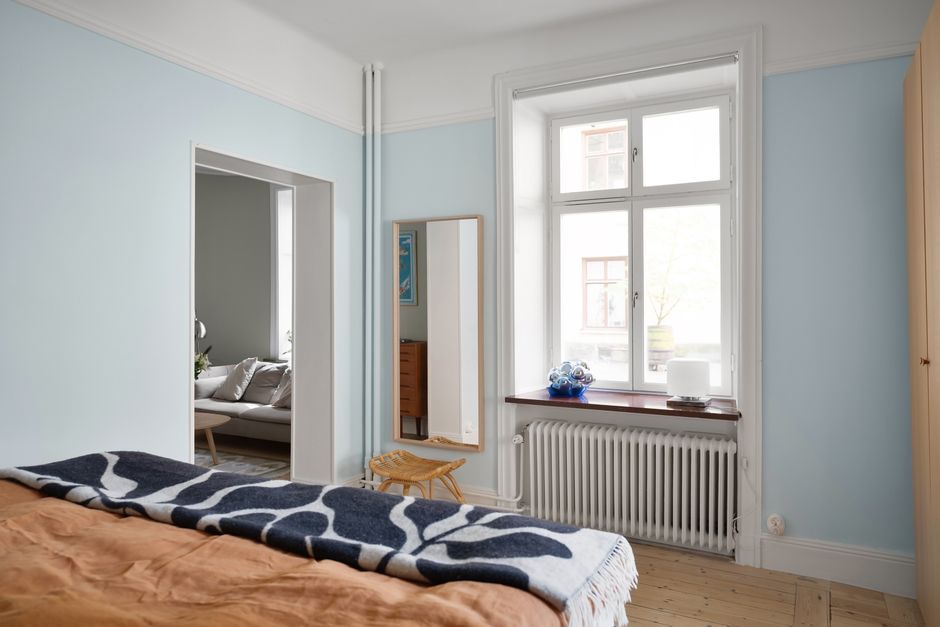
Photo by KoolShooters via Pexels.
Accessibility counts as emotional design
Roughly 8% of men and 0.5% of women have some form of color vision deficiency. Regulating mood through color still requires readable contrast and redundancy — warmth carried in composition and copy, not hue alone — or the design accidentally excludes the person it's meant to reach.
FAQ
Is color psychology pseudoscience? Context matters enormously, but controlled research consistently finds hue and saturation affect arousal and evaluation — not deterministically, but reliably enough to design with.
Should I match the recipient's favorite color? If you know it, yes — specificity reads as care. If not, match the state you want to support, not a guess about their decor.
How is this different from a pillar-four design study? Design studies analyze one image's craft. This is the general psychology underneath all of them — the reason those craft choices land at all.