Your Words Need a Place to Sit
A beautiful image can still swallow your message if the text has nowhere to land. Flexible placement — not just a prettier font — is what keeps a digital card readable and personal.

Your Words Need a Place to Sit
You've found the image. You've got the line. Then the template drops your sentence dead-center over someone's face — or into a busy corner where the type disappears into leaves and light.
The problem isn't that you chose the wrong words. It's that the words never got a seat.
Placement is part of care
We've written about typeface voice and about contrast that fails silently. This is the third leg of the stool: where the text lives on the art.
Negative space isn't empty decoration — it's reserved room. Design studies on this blog keep finding the same thing: the quiet corner of a photo is often where a short message belongs. If a platform only offers one locked text box, that corner doesn't matter. Your care gets flattened into a caption.
Flexible text design — move it, size it, let it breathe against the composition — is how intention survives contact with a real image. Not "fancier fonts for fun." A place for the sentence to sit without fighting the picture.
Nugget: If the image is doing emotional work, the words need a quiet chair — not a spotlight in the middle of the stage.
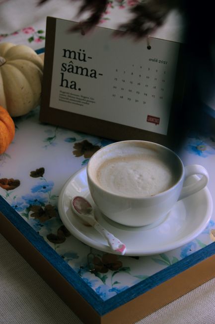
Words are part of the composition — not a sticker on top. Photo by alleksana via Pexels.
What to look for when you personalize
Find the rest area first. Soft blur, open sky, a plain shoulder of fabric — put the line there.
Keep it short enough for the space. Six honest words beat a paragraph that has to shrink into illegibility.
Check the phone crop. What looked balanced on desktop may bury your text when opened on a smaller screen — another reason flexible layout matters (cross-device design).
Let Design Studio be a craft step, not an afterthought. Pick the art for them, then place the words like you mean them.
When you're ready, start at TheBlueBrook — choose a card that already feels like them, then give your line a place to sit. Or browse the full library when you want to see how wide the moods go before you decide.
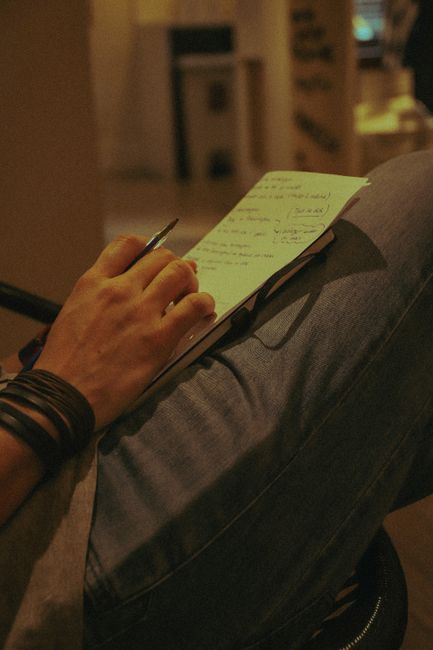
The craft is choosing where the sentence belongs. Photo by Renan Almeida via Pexels.