Constellations as Conversation: A Design Study in Pattern and Patience
A vertical night sky — Orion's belt, scattered field stars, a low cloud bank — shows how recognizable patterns in vast darkness give a sender something specific to point at without filling the frame.
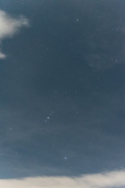
Photo by Maria Laura Catalogna via Pexels.
This image isn't asking you to admire a nebula close-up. It's a field — hundreds of pinpoints on a blue-black gradient, with Orion's belt anchoring the middle left and a soft cloud shelf rising from the bottom. The emotional register is different from the Milky Way core piece we studied earlier: less epic scale, more shared map — something two people might both look up at and recognize.
Why patterns matter more than spectacle here
Constellations are culturally portable shorthand. Three stars in a row isn't just geometry; it's a reference most viewers can meet halfway. For a card, that means the image carries built-in specificity without depicting a private memory — "look, there's the belt" is already halfway to "look, I'm thinking of you under the same sky."
The palette stays narrow: deep navy (#485B69 average tone), white-blue stars, faint grey clouds. No warm accent fights for attention. Message text in a warm off-white would read as spoken quietly against cold air — complementary hue without breaking the night logic.
Where text belongs in a star field
Unlike a portrait with obvious negative space, star fields offer distributed quiet — zones of lower stellar density rather than blank panels. The upper-right quadrant here is comparatively thin; the cloud band at bottom provides a horizontal anchor if you want text to feel grounded rather than floating.
Short lines win. A constellation image argues against paragraphs; it wants a sentence that behaves like a pointer: "Same sky. Different window."
Nugget: Astronomical imagery works for greetings when it offers a shared reference point, not when it tries to overwhelm with scale — pattern is intimacy at cosmic distance.
Cloud as unintended frame
The low cloud bank functions like a soft stage edge — not a vignette, but a brightness gradient that keeps the eye from exiting downward. Senders choosing this image inherit that frame for free; text above the cloud line stays "in the sky."
This is pillar-four craft in one decision: pick an image where the composition already argues for brevity, cool tone, and a single recognizable hook — then personalize the hook, not the whole sky.