
The Distance Between Stars: A Design Study in Scale and Patience
A single long-exposure photo of the Milky Way core shows how scale, near-dark color, and unhurried framing can make a message feel like it traveled a long way to reach someone.

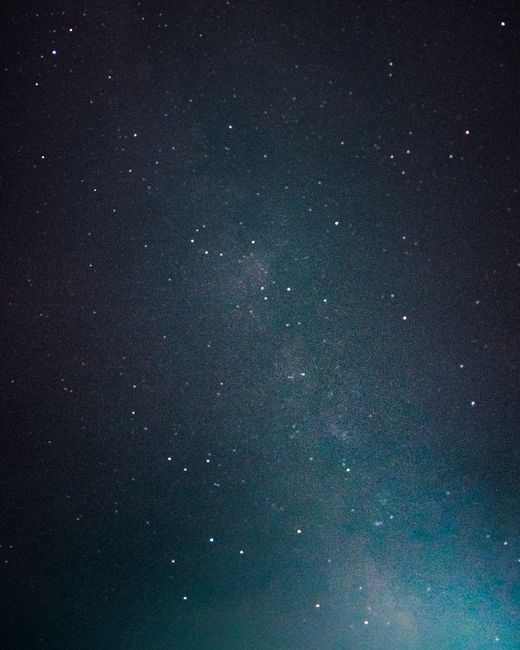
Photo by Abbas Zaidi via Pexels.
Most of this frame is doing nothing. That's the point. A portrait-oriented sky, mostly near-black, holding a faint teal-green wash of galactic core low in one corner and a scatter of pinprick stars everywhere else. No subject in the foreground, no face, no object to anchor on — just scale. And scale, it turns out, is its own emotional register, one the brand's usual close, warm imagery doesn't reach.
Why does darkness read as full instead of empty?
The color story here is almost the inverse of a candlelit still life or a sunlit embrace: instead of warmth against cool, it's near-black against a whisper of teal. The average tone sits around a deep #21313E — not true black, but a navy dense enough to feel like depth rather than absence. Against that, the Milky Way's dust glows a cool blue-green, and individual stars punch through as warm pinpricks of white and pale gold. That tiny warm-cool contrast, repeated hundreds of times at a scale of single pixels, is what keeps the image from reading as a flat void. The eye doesn't rest in one place; it drifts, star to star, the way attention drifts across a night sky in person.
Nugget: Vastness isn't the opposite of intimacy — it's intimacy at a different scale. A message that says "wherever you are, I'm looking at the same sky" borrows this image's actual physics.
Where does a message belong in an image with no obvious empty corner?
Here's what makes this photo different from the negative space we've studied before in a shoulder or a tabletop: there isn't one quiet patch to point to. The upper-left third is the least busy — fewer stars, no trace of the galactic glow — but it's not empty so much as thin. That thinness is the design lesson. A short line of text here wouldn't need a blank field to sit in; it would need only enough restraint from the image not to compete, the same restraint the stars themselves show by staying small and distributed rather than clustering into one bright mass.
What does the long exposure itself teach about sending something?
This image couldn't have been taken quickly. Capturing a galactic core this clearly means a long shutter, a tripod, patience while the earth turned. That process is worth naming directly, because it's a rarer thing to model in a design study: some images earn their feeling not through composition choices but through the time invested in making them. A card built around this photograph inherits that patience — it's not a message dashed off, it's one that implies someone stood still in the dark for a while, waiting for something worth showing up.
That's a different kind of personalization than warmth or color-matching. It's the kind that says: this took time, the way reaching you took time.