The Quiet Math of an Embrace: A Design Study in Warmth, Blue, and Restraint
A single close-up of two people holding each other shows how color temperature, soft framing, and unclaimed space can carry a message before a single word is written.
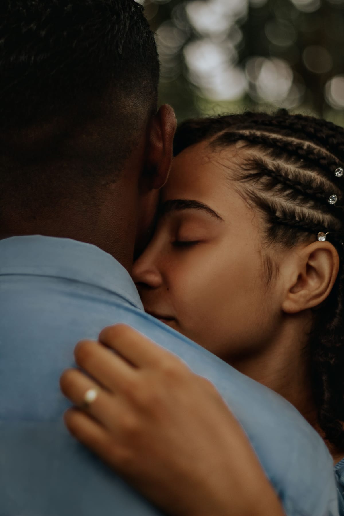
Nothing about this photograph is staged for legibility. There's no obvious "frame" for a message, no blank corner waving a hand. And that's exactly why it rewards a slower look — the negative space here isn't empty, it's earned, and understanding how tells you something useful about picking or personalizing any card meant to carry real feeling.
Where the color is doing the work
The palette splits cleanly into two temperatures. Skin tones — hers especially, catching warm, low light across the cheekbone and brow — sit on the amber-to-terracotta end of the wheel. Against that, his shirt is a muted, almost dusty blue-grey. Blue and orange aren't quite opposite on a strict color wheel, but they're close enough to read as complementary, and that's what gives the image its quiet tension: warmth (closeness, skin, breath) held against cool (structure, stability, his shoulder as the literal support she's leaning into). Neither color is saturated or loud. This isn't a poster; it's a moment, and the muted values keep it from tipping into anything performative.
Behind them, soft green bokeh with a scatter of light — trees, maybe late-afternoon sun through leaves — reads as a third, background temperature: cool-neutral, blurred into abstraction. It never competes with the two faces because it's been thrown so far out of focus it becomes almost pure color and light, not "scenery."
The negative space nobody planned
Here's the part worth sitting with: the largest single area of low-detail, low-contrast surface in this frame is his shoulder and shirt — the blue fabric filling the bottom-left third. It's not empty in the graphic-design sense (there's fabric texture, a hand, a ring), but it's visually quiet relative to the two faces pressed together above it. That's where a short handwritten-style line — "I've got you," a date, an initial — would sit without ever needing to fight the emotional center of the image for attention. Compare that to the blurred bokeh in the upper right: technically also negative space, but it's busy with implied light and would swallow small text rather than hold it.
This is the pattern worth carrying into any card choice: negative space isn't wherever the background happens to be plain. It's wherever the eye is willing to rest before moving to the meaning.
Framing as intimacy, not composition
The crop is tight and off-center — his head anchors the left edge, cut at the jaw; her face, eyes closed, sits just right of center. There's no visible horizon, no wide establishing shot. That choice does something specific: it puts the viewer inside arm's length of the embrace rather than observing it from a polite distance. Research on mental imagery backs up why that framing choice matters more than it might seem — pictures process through the same neural pathways as lived emotional experience and autobiographical memory, which is part of why an image can land with more immediate feeling than the equivalent sentence describing it (Holmes & Mathews, Clinical Psychology Review). A tight, unposed crop isn't just aesthetic preference — it's the mechanism by which the photo bypasses "look at this" and goes straight to "feel this."
What to take from it
If you're choosing an image for someone you love, the instinct is often to reach for the most polished, most symmetrical option. This one argues the opposite: closed eyes, a partial face, an off-kilter crop, and one quiet patch of blue fabric can carry more weight than a wider, tidier frame ever would — because the imperfection is what makes room for the recipient's own memory to fill in the rest.