The Weight of a Hand: A Design Study in Touch, Shadow, and Restraint
A close-up of two clasped hands, lit almost to darkness, shows how shadow can be a design choice rather than an absence — and where a message belongs when a photo refuses to show a single face.

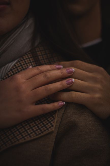
There are no faces in this photograph. No eyes to read, no expression to interpret. Just two hands, one resting over the other on a shoulder, and almost everything around them given over to shadow. That absence is the whole design — and it's worth slowing down on, because it argues for a different way of picking an image than "find the happiest face."
Shadow isn't the background here — it's the material
Most images ask a viewer to separate subject from background. This one barely lets you. The palette sits almost entirely in near-black and deep umber — the averaged color of the frame reads closer to espresso than to any single hue — and the hands themselves are the only area lifted into real light. There's no bright sky, no clean wall, nothing performing "backdrop." The dark isn't empty; it's doing the same job negative space usually does, except instead of a blank plane, it's texture disappearing into itself: a collar, a shoulder, a second person's hair, all present but declining to compete.
That's a useful reversal. A card image doesn't need bright, evenly lit space to hold a message — it needs contrast discipline. One small, deliberately lit area against a large quiet one reads as intimate rather than underexposed, as long as the quiet area is genuinely quiet and not just dim.
One accent color is doing all the emotional signaling
Against all that brown and black, there's exactly one note of saturated color: a soft mauve-pink on the fingernails. It's small — a few square centimeters of the whole frame — but it's the only place your eye lands with any speed, precisely because nothing else in the image is fighting for that role. This is the accent-color principle in miniature: when a composition commits to a narrow, muted palette everywhere else, even a modest spot of color reads as chosen, not incidental. For a sender personalizing a card, the lesson transfers directly — one warm, specific detail (a shared color, a small object, an initial) will register more than five competing ones.
Texture as a quiet frame
Look at the fabric under the hands: a fine plaid, barely visible in the low light, its faint grid running at an angle to the frame's edges. It isn't a border in the literal sense, but it functions like one — a subtle structural pattern that keeps the eye from sliding straight out of frame, without ever asking to be noticed on its own terms. Compare that to a hard photographic vignette, which announces itself. This is the opposite: framing that only reveals itself once you're already looking closely, which is exactly the kind of attention a personal message rewards.
Where a message would actually sit
If this image carried text, it wouldn't belong near the hands — that's the visual center, already doing its job. It would sit in the dark upper field, where the second person's hair and collar blur into near-nothing. Placed there in a light, warm-toned type, a short line would read as emerging from the shadow rather than interrupting it — the same way the mauve accent emerges from the brown without shouting.
Nugget: The most intimate images aren't always the brightest or the most legible — sometimes restraint, a single accent, and a willingness to let most of the frame stay dark is what makes a photo feel like it was caught rather than staged.
This is also a photo entirely without faces, which is its own quiet argument: closeness doesn't require an expression to prove itself. A hand resting on a shoulder can carry as much weight as any smile — worth remembering the next time an image search defaults straight to "couple laughing together."