Your Card's First Frame Might Be the Lock Screen
Animated cards worry about frame zero inside the browser — but for many recipients, emotional primacy starts earlier, in the notification preview and subject line that decide whether the card gets opened at all.

Your Card's First Frame Might Be the Lock Screen
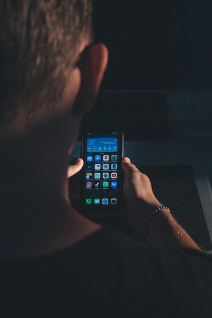
We have written plenty about what happens when frame zero stalls inside an animated card. That analysis is right — motion performs on load. But it is incomplete if we treat the card URL as the beginning of the experience. For most people on phones, the card starts on the lock screen: a sender name, a preview line, maybe a thumbnail. Open or swipe away happens there, often in under two seconds.
The primacy effect does not wait for your animation to boot. Whatever tone lands first — warm, generic, alarming, blank — gets weighted heavily in memory. A beautiful card that arrives with a subject line reading "You have received an eCard" has already spent its opening second on bureaucracy.
What senders actually control before load
| Layer | What the recipient sees | Design lever |
|---|---|---|
| Notification title | Sender or platform default | Personal sender name beats brand boilerplate |
| Preview / subject | First words of the message | Specific beats template |
| Thumbnail | Static image if the channel provides one | Should match emotional intent, not a logo tile |
| Timing | When the ping arrives | Scheduled send respects attention, not just calendars |
That last row connects to something we keep seeing in relationship research: small repeated rituals work because they arrive when both people recognize the moment. A card scheduled for 7 a.m. on a travel day reads as interruption; the same card at 8 p.m. reads as company. Delivery time is not a backend detail — it is framing.
Preview text is copywriting, not metadata
Platforms often auto-fill previews from the first line of body text or from platform defaults. Senders who treat the opening sentence as ceremonial ("Dear Friend, I hope this finds you well") waste the only words many recipients ever see without opening. Lead with the emotional payload — the name, the inside joke, the single line that only makes sense to two people.
Generic preview copy also fails the anyone test: if a stranger could read the notification and understand nothing personal, it will feel like mail, not a gift.

Photo by cottonbro studio via Pexels.
Nugget: The card you designed is not the first frame — the notification is. If that frame feels cold, many recipients never reach the art.
FAQ
Isn't this just email marketing advice? Same psychology, different stakes — one-to-one care, not a campaign blast.
Do all channels show previews? No — but design for the strictest common case (mobile push + email) and you cover most paths.
What about silent delivery? Some senders prefer no ping at all; that is also a choice with emotional meaning — "no interruption" can read as respect or as absence, depending on the relationship.