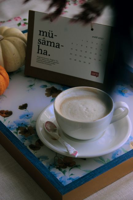
Color Moves Feeling, Not Occasion
When choosing a card's palette, you're not matching an occasion label. You're picking colors that nudge the recipient toward a state they need: calm, energy, tenderness, safety.

Color Moves Feeling, Not Occasion
When you're choosing a card to send someone, the temptation is to match the occasion: red for love, blue for sympathy, yellow for celebration. But color research suggests a better question: What emotional state do you want the recipient to move toward?
Warm palettes (reds, oranges, high saturation) tend to increase energy and grab attention. Cool palettes (blues, greens, desaturated tones) lower arousal and create calm. Neither is universally right — they're levers for shifting how someone feels the moment they see the message, often before they read a word.
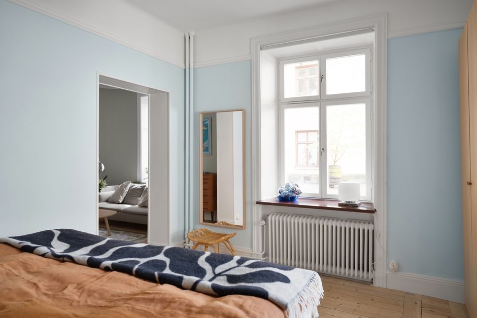
Photo by KoolShoolers via Pexels.
That's co-regulation at a distance. Your choice of palette — the intentionality behind it — tells the recipient they were seen. Not as someone celebrating a calendar event, but as someone in a state they need support moving through.