
capabilities
Your Words Need a Place to Sit
A beautiful image can still swallow your message if the text has nowhere to land. Flexible placement — not just a prettier font — is what keeps a digital card readable and personal.

capabilities
A beautiful image can still swallow your message if the text has nowhere to land. Flexible placement — not just a prettier font — is what keeps a digital card readable and personal.
capabilities
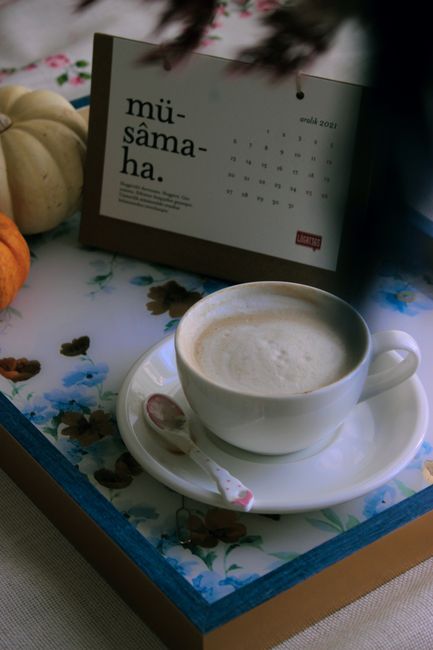
Scheduling a card isn't procrastination — it's choosing the moment your message meets their day. Here's why delivery timing belongs in the craft of a digital send, not just the afterthought menu.
capabilities
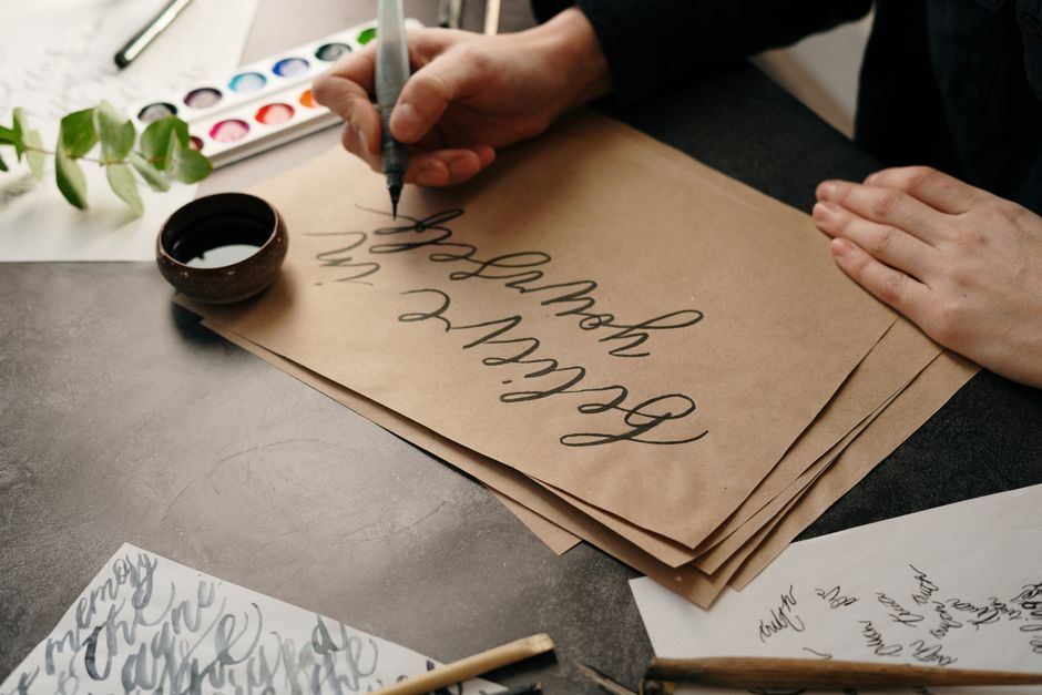
Before anyone reads your words, the typeface has already spoken — warm or formal, human or machine-made. Here's what research says about matching font to mood, and why flexible text design isn't a cosmetic extra.
animation
Animated cards start performing the instant they load — a stalled first frame reads as broken care, not a technical glitch.

notification-design
The most respectful notification is one that tells the truth immediately — because a message from someone who thought of you doesn't need manipulation to matter.
capabilities
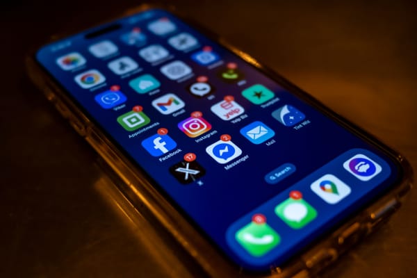
Most app notifications are built to pull you back in. A message notification only has one honest job: tell you someone thought of you.

accessibility
Alt text, color contrast, and screen-reader compatibility aren't a legal checkbox bolted onto design — for an emotional message, they're the difference between a card that's received and one that quietly never arrives at all.
capabilities
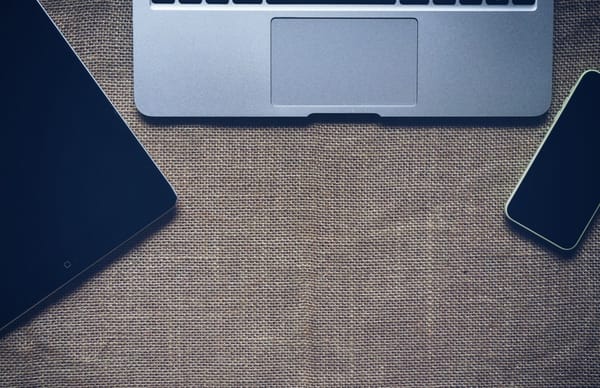
A digital card is authored on one screen and opened on another, often minutes later. Flexible, mobile-first design is what keeps the message intact across that gap.