The Font Is Part of the Message: Why Typeface Choice Matters in Digital Cards
Before anyone reads your words, the typeface has already spoken — warm or formal, human or machine-made. Here's what research says about matching font to mood, and why flexible text design isn't a cosmetic extra.
The Font Is Part of the Message: Why Typeface Choice Matters in Digital Cards
You picked the image. You wrote the line — short, true, a little awkward in the way real feelings are. Then the platform offered you a default: clean, neutral, same as every other message that left the building today.
You paused. Not because the words were wrong. Because the voice was. A playful photo with corporate sans-serif. A tender note in something that looked like a parking sign. The mismatch was subtle enough to ignore — and obvious enough that your recipient would feel it without naming it.
Typography isn't decoration on a digital card. It's paralinguistics for the eye — the visual equivalent of tone, pacing, and whether someone is whispering or announcing.
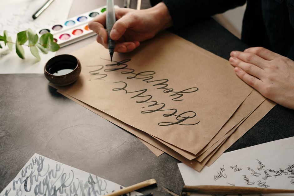
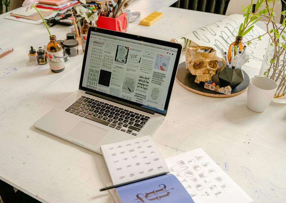
The hand matters — even when the hand is a typeface. Photo by cottonbro studio via Pexels.
Nugget: People read words. They feel typefaces. By the time the first sentence lands, the font has already told them how seriously to take what follows.
Why does a typeface reach feeling before language?
Because the brain doesn't wait for you to finish decoding letters before it starts forming an impression.
Research on typography and affect finds that fonts carry semantic and emotional associations independent of the words they spell — joy-linked typefaces often skew handwritten; highly stylized display faces read differently from neutral text faces (Kulahcioglu & de Melo, FontLex / typography-semantics research). Studies on email perception show that font choice changes how readers judge the sender — including traits like professionalism and warmth — even when the body copy is identical (Shaikh et al., cited in typography perception research). Congruency matters: when typeface and content pull in opposite directions, the message fractures.
That's not branding jargon. It's Tuesday afternoon with someone you love. A line that says I'm proud of you in a stiff, all-caps system font can read like HR. The same line in a gentle script reads like a person. The words didn't change. The relationship signal did.
Handwritten warmth vs clean sans: when does each belong?
Marketing research on typeface design offers a useful split — not as rules, but as defaults to question.
In a series of experiments on charitable appeals, Trudel, Argo & Meng found that handwritten-style typefaces increased engagement partly by boosting a sense of interpersonal connectedness — the feeling that a human, not a machine, was on the other end of the message. Handwriting implies effort, presence, and emotional investment; typewritten styles read as more formal, mass-produced, and efficient.
For one-to-one digital cards, that maps cleanly onto sender intent:
| Typeface register | What it tends to signal | Works when… | Risks when… |
|---|---|---|---|
| Handwritten / script | Warmth, effort, intimacy | Soft news, inside jokes, thinking of you sends | The moment needs gravity or clarity (sympathy, instructions) |
| Humanist sans-serif | Friendly, modern, readable | Everyday notes, long-distance check-ins | Paired with highly ornate art — can feel generic |
| Geometric sans-serif | Clean, efficient, neutral | Minimal imagery, short factual lines | Emotional content that needs tenderness |
| Serif / classic | Tradition, weight, ceremony | Milestones, formal gratitude | Casual friendship sends — can feel like a certificate |
None of these rows is a law. Congruency is the law: the font should match the image, the relationship, and the emotional temperature of the line — the same principle that makes a wrong notification preview feel cold before the art loads.
What does congruency look like on a real card?
Picture three sends to the same person:
1. Silly. A ridiculous pet photo. The line is one inside joke. A bouncy script or loose handwritten face keeps the register honest — anything too polished breaks the bit.
2. Steady. A muted landscape, a long-distance subtext. A humanist sans with generous line spacing reads as I'm here, not I'm performing being here.
3. Heavy. Sympathy, bad news, a hard anniversary. A restrained serif or calm sans at comfortable size says I took this seriously — while florid script can feel like the platform chose the emotion for you.
The failure mode is always the same: template voice. A name inserted into typography that was never meant for this image, this person, or this Tuesday.
We've written separately about contrast and legibility — whether someone can physically read the words. This piece is adjacent but different: even fully legible text can feel wrong. Accessibility gets the message to the eye; typography gets it to the gut.
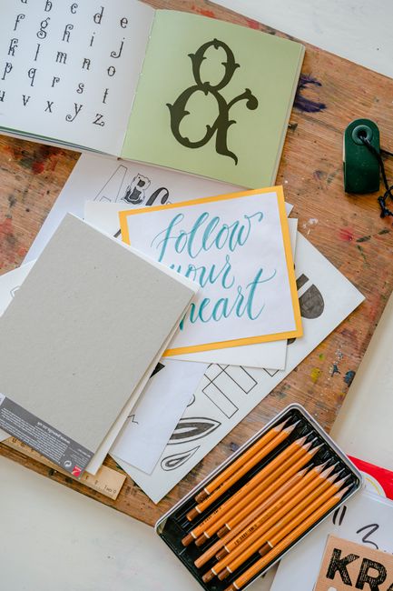
Choosing type is choosing voice — not just layout. Photo by AI25.Studio Studio via Pexels.
Nugget: Legibility asks can they read it? Typography asks does it sound like you? Both have to pass.
Why does effort show up in the typeface?
The effort heuristic — recipients valuing gifts more when they believe the giver invested time — applies to visible craft in digital messages too. A handwritten-style line signals that someone didn't only tap send; they shaped the message.
That doesn't mean fake handwriting is magic. Recipients aren't fooled by cosmetic script on generic copy. Effort shows when type choice interacts with specific words and specific imagery — when the whole card looks like one person's decision, not a default stack.
Digital body language research on emoji and punctuation applies here as well: small paralinguistic choices accumulate. Font weight, letter spacing, line breaks — they're all part of whether a message reads warm, rushed, or copied from a catalog.
Practical choices for senders
You don't need a design degree. You need a quick congruency check:
- Pick the image first, then audition type against it. If the art is soft, avoid hard geometric faces unless you're deliberately contrasting.
- Short lines love expressive faces; long lines love readable ones. Script for six words; humanist sans for a paragraph.
- Watch size and spacing, not just family. A good face at the wrong size still feels like a template.
- Run the swap test on typography. Would this font make sense if the message were for anyone? If yes, consider something more you.
- Don't fight the platform default by accident. If you didn't choose the type, you probably didn't choose the voice.
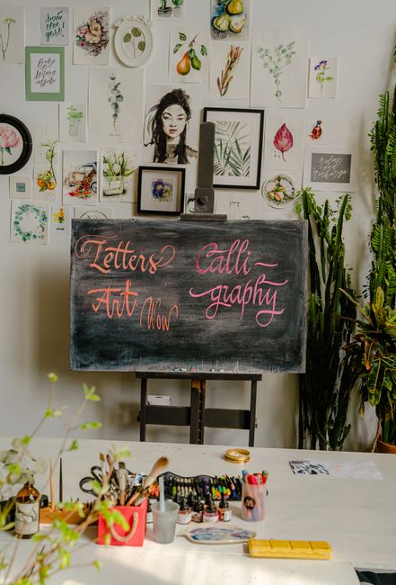
Expressive type works when it matches the moment — not when it decorates a template. Photo by AI25.Studio Studio via Pexels.
Where product design enters
Most greeting products treat text as an afterthought: one field, one font, maybe bold if you're lucky. That's how emotionally specific images end up wearing generic voice — and why recipients feel the gap even when they can't name it.
Flexible text design — multiple readable faces, sizing, placement, color that respects the image — isn't a feature list item. It's the mechanism that lets intention survive contact with the screen. The same way emotion-first discovery helps senders start from feeling instead of holiday SKUs, flexible typography helps the words sound like they belong to the feeling.
That's why TheBlueBrook's Design Studio treats type as part of the composition — not a caption bolted on after the art is chosen. Browse by mood and imagery first; then shape text until it matches them, not the platform's default personality.
Frequently asked questions
Isn't any readable font good enough? Readable is necessary, not sufficient. Research consistently shows typeface affects perception and connectedness beyond raw legibility (Trudel et al.; typography-affect work).
When should I avoid script fonts? When clarity outweighs warmth — complex information, formal condolences that need steadiness over sweetness, or any moment where performative curls would feel like the platform speaking instead of you.
Does handwritten type feel fake on digital cards? It can, if the words are generic. Pair expressive type with specific copy and imagery; congruency does the honest work.
How does this relate to accessibility? Contrast, size, and structure determine whether text arrives at all; typeface register determines how it lands. Both matter — see our piece on contrast failing silently.
The last word
You already know this from life outside cards. A text in all caps lands different from the same words in lowercase. A handwritten envelope in the mail stops you before you open it.
Digital cards aren't exempt. The image pulls someone in; the font tells them whether to relax, laugh, or brace. Ignore that layer and you can send something beautiful that still sounds like it was meant for anyone.
Next time you send, ask one extra question after what do I want to say? — how should it sound when they read it? The right typeface is often the answer hiding in plain sight.
Digital sending, human voice — the typeface is where those two meet. Photo by AI25.Studio Studio via Pexels.